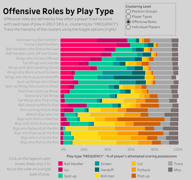
I’ve used several clustering approaches to group players by offensive role using Synergy’s play-type data. My approach has been to sort players by the types of plays which they have used to try to score. The NBA’s stat site breaks down individual scoring attempts into 11 types of plays: scoring as the pick-and-roll ball-handler, in isolation, with a spot-up shot, working around an off-ball screen, from a handoff, as the roll man, off a cut, on a putback, on a post-up, in transition, or anything in between. Click on the image below to explore the offensive roles in an interactive dashboard.
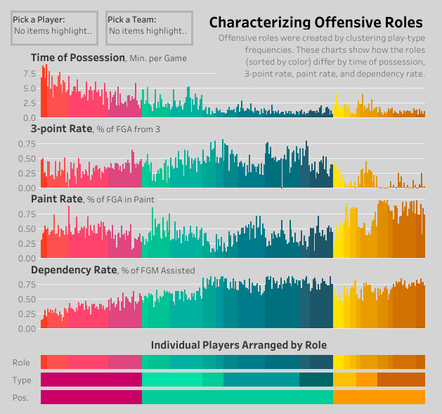
The next chart takes these algorithmically-defined offensive roles and shows how they relate to some other useful stats – time of possession, percent of field-goal attempts from 3, percent of field-goal attempts from the paint, and percent of made field-goals that were assisted. If you want to see each bar annotated with the player names, click on the image below to visit an interactive version.
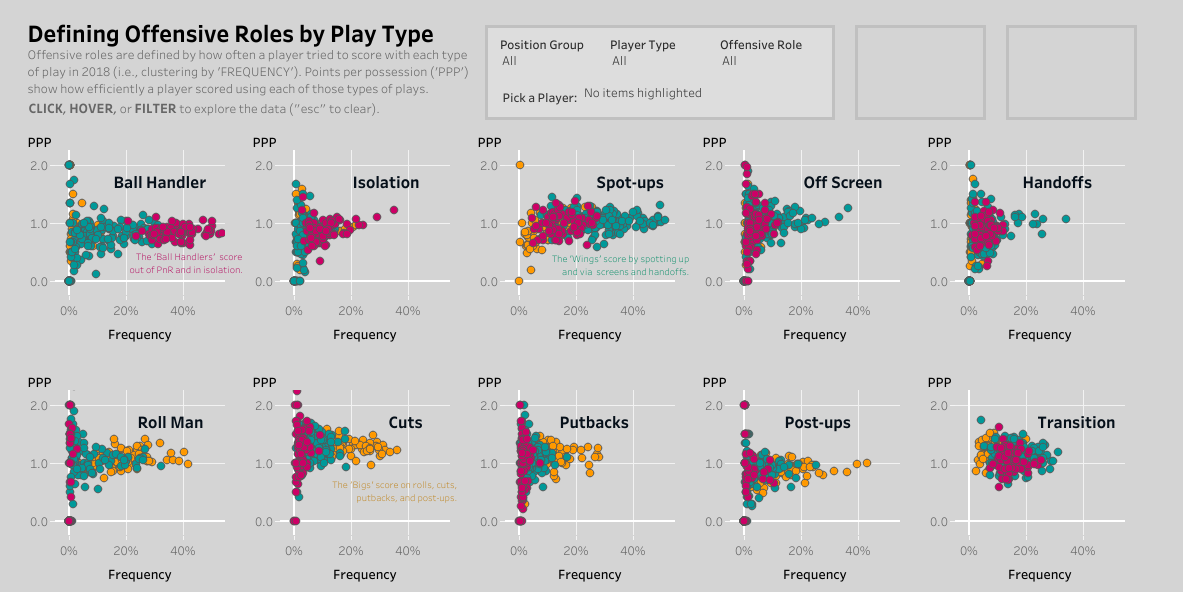
Here are the ten types of plays that I used to sort out the offensive roles. Click on the image below to visit a dashboard where you can highlight a particular player – how often did he try to score in isolation (frequency)? How many points per possession did he score when he tried (PPP)?
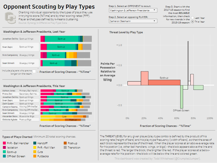
I used the same approach to group Division 3 NCAA players by offensive role. I created an opponent scouting dashboard to help predict how each opposing player would try to score and in which types of plays he would pose the greatest threat.
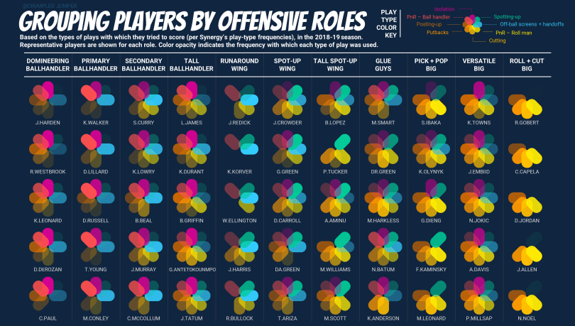
Most recently I used four seasons of NBA play-type data to make my own role-sorting formulas. In the end, I came up with 11 offensive roles — four types of ball handlers, three types of wings, and three types of bigs, with one jack-of-all-trades grouping, stuck somewhere in the middle. I used a multi-colored 8-petaled flower to visualize which types of scoring chances were used by players in each of the 11 offensive roles. Each petal represented one type of play, with its opacity showing how frequently that play was used. Each color was linked to the percentile rank of the corresponding play-type frequency; so that, if a player used a particular type of play less often than the rest of his peers, that petal was completely transparent. If a player used a particular type of play more often than the rest of his peers, then the petal was completely opaque. The result is that the ball handlers have the brightest pinks and purples, the wings have the brightest greens and blues, and the big men have the brightest yellows and oranges. In the image above, there’s a column with five players to serve as examples for each role.
Defining offensive roles in this way has some potentially-practical applications. Role definitions could be a starting point for understanding how to optimize a team’s lineup fit. They could be a first step to finding useful player comps. And they could help explain the dynamics of the free-agent marketplace.
Check out more useful projects.
