After reading the book “Algorithms to Live By: The Computer Science of Human Decisions” by Tom Griffiths and Brian Christian, I was inspired to look at shot selection as an optimal stopping problem. I created a simple measure of shot quality based on the NBA’s shot-tracking data, i.e. closest defender distance, number of dribbles preceding the shot, and the action preceding the shot. I accessed the 2019-20 shot data using a Python package created by Darryl Blackport and looked at how shot quality changes with the amount of time remaining on the shot clock for every team in the NBA.
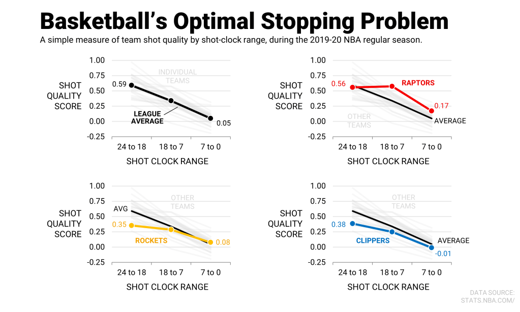
As we would expect from the threshold rule, league-average shot quality scores decreased from early in the shot clock (+0.59) to late (+0.05). But, apparently, not every team has the same thresholds for shot quality. For example — based on my simple shot-quality scores — the Rockets settled for the second-worst early-clock shots (+0.35) and the Clippers took the fourth-worst (+0.38).

Inspired by Ben Falk from Cleaning the Glass, I made some charts to illustrate league-wide trends in the relative value of 3-pointers vs. 2-pointers since 2002.

I created an interactive dashboard showing trends in shot selection. The widths of the bars show the fraction of field-goal attempts taken at the rim (in blue), from 3 (green), and everywhere in between (red). The heights of the bars show the average number of points per shot from each location. Click on the image below to filter by team, player, or season.

This still image from the dashboard compares how league averages changed from the 2003-04 season to the 2018-19 season.
Brook Lopez is modern shot selection personified. I used a GIF builder called GIMP 2 to animate heat maps from NBA.com to demonstrate how his shot chart has evolved over the years:

Check out more useful projects.
